Client
PeakPlan (fitness SaaS)
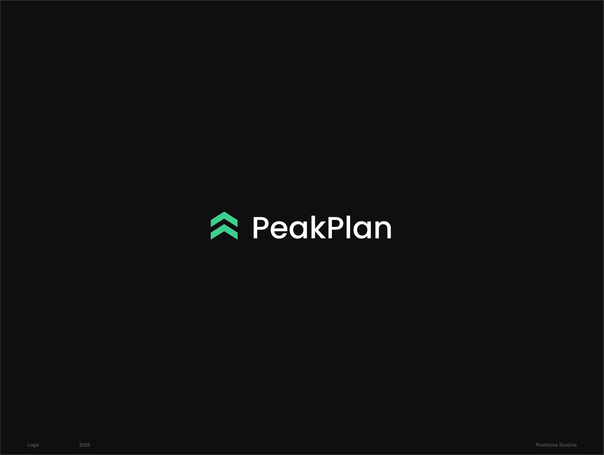
Prakhova Studios designed a clean, modern logo for Peakplan, an early-stage fitness product preparing for launch. The goal was to create a simple, marketing-ready brand mark that felt closer to SaaS than to traditional sports branding.
Client
PeakPlan (fitness SaaS)
Focus
Logo and icon design
Scope
Symbol, wordmark, color direction, SVG logo for landing page and mobile use
Timeline
1 week
Peakplan needed a limited-scope logo for its pre-launch landing page and early marketing use. The client wanted a clean and modern identity that avoided typical fitness visuals such as weights, muscles, or aggressive sports styling. Prakhova Studios developed a sharper, more contemporary logo direction based on an upward double-chevron concept that suggests progress, structure, and momentum. The result gave the product a simple, flexible identity suitable for digital marketing, mobile icon use, and future brand development.
The client needed a fast, focused logo solution without building a full brand system at this stage. The mark had to feel credible in marketing channels and small digital formats while avoiding generic fitness or sports logo tropes. It also needed to leave room for a broader identity system in a later phase.
Prakhova Studios built the logo around a refined double-chevron symbol derived from the client’s preferred direction. The rounded version from the earlier reference was reworked into a cleaner, sharper, and more modern form that aligned better with SaaS-style branding. The final concept used a green tone and included two wordmark variations to support early testing and pre-launch use across landing page and mobile contexts.
Selected
Full case pages — structured, consistent, and easy to browse.
Get an estimate online or send a short brief — we reply within 24–48h.